Balance sheet example below shows various components of the key accounting document including assets, liabilities and owner’s equity. Balance sheet is the foundational accounting concept helping businesses understand their worth.
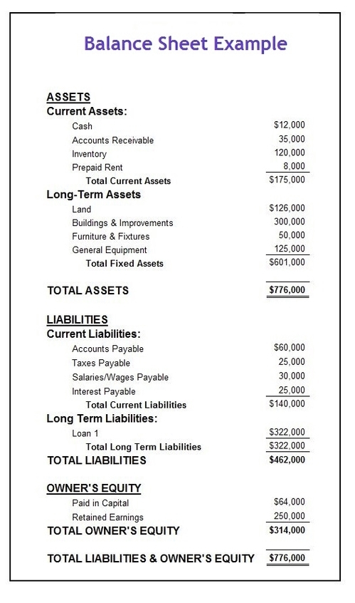
Balance sheet example below shows various components of the key accounting document including assets, liabilities and owner’s equity. Balance sheet is the foundational accounting concept helping businesses understand their worth.
Investment asset classes explained in the below diagram including the three main asset classes that are equities (stocks), fixed income (bonds) and cash equivalent. There are other investment asset classes including real estate, land, commodities, cryptocurrencies and collectiables.

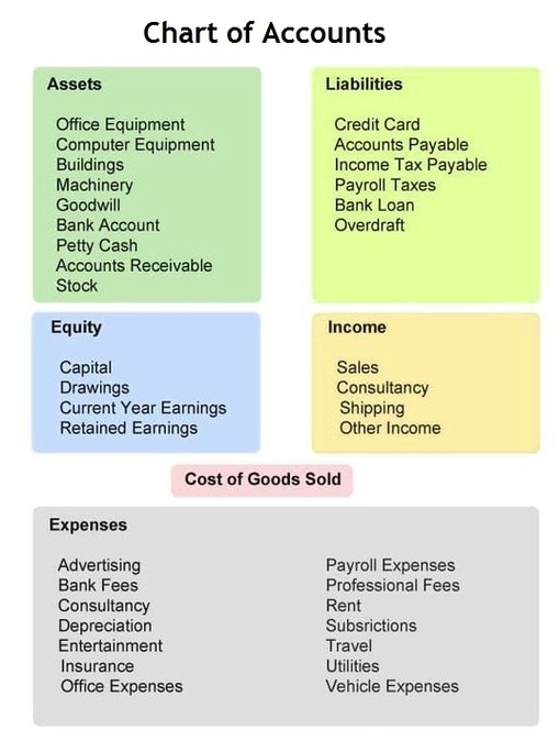
A chart of accounts is a listing of the names of the accounts for recording transactions in its general ledger. Chart of accounts (COA) is an organizational tool that provides a breakdown of all the financial transactions conducted during a specific accounting period, divided into subcategories.
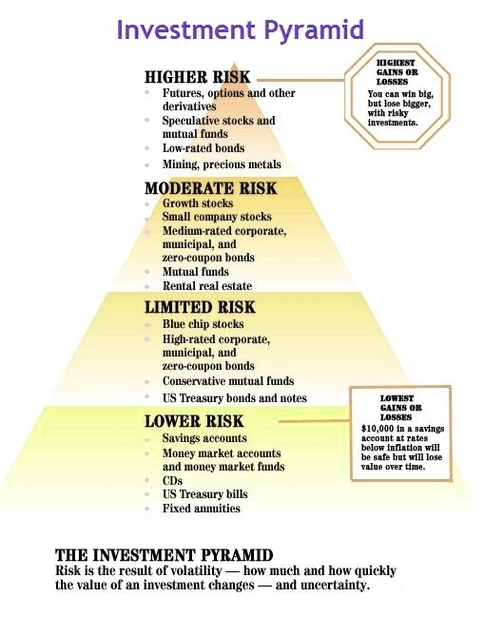
The Investment Risk Pyramid is an asset allocation framework for investors to choose different assets classes. This helps one to decide how to diversify a portfolio according to their risk tolerance and expected returns. The base of the investment pyramid below is lowest risk but also lowest return.
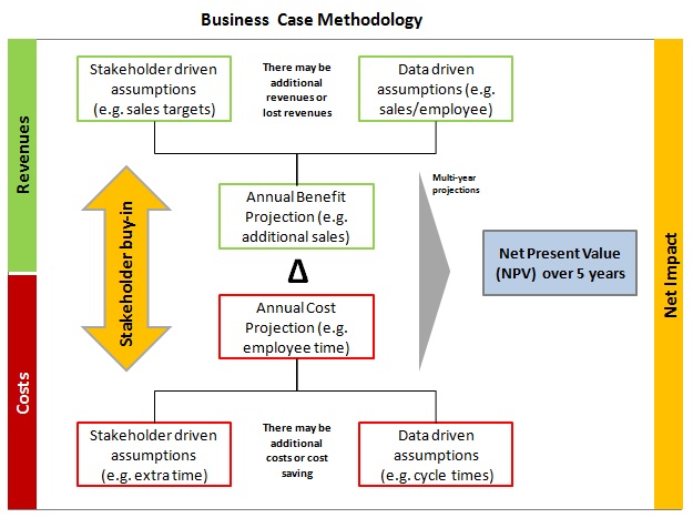
Business Case Methodology: business cases are prepared to help a company decide whether to proceed with a given project. To start off, the preparation of the business case requires understanding of the key metrics or key drivers that help company either generate or spend money. The money can be generated by increasing revenues or sales and/or decreasing costs. The key revenue driver is increased sales, for example due to an increased number of sales agents. Decreased costs may be as a result of increased capacity in the back office, because some of the processes that used to be manual are now automated. The more data used for the assumptions the better. Another way to validate assumptions is to obtain the key stakeholder opinion or buy-in.
Usually, any project also carries investment costs that are subtracted from the benefits. A good business case also has a multi-year view, e.g. creates 5 year projections. This future cashflow is discounted by the interest rates. The sum of these discounted cash flows is added to come up with a net present value – NPV for the project. Other business case metrics include the internal rate of return – IRR and average annual benefit.
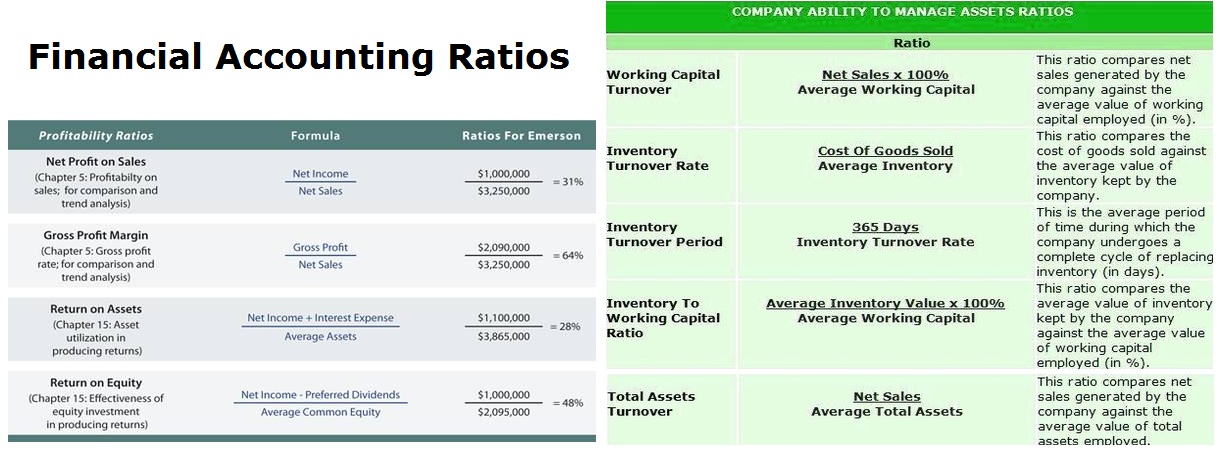
Accounting Ratios are used to evaluate company’s performance and relevant standing against its competitors. The list of the key accounting ratios includes profit margin, gross margin, asset turnover ratio, current ratio, quick ratio and other ratios.
Financial accounting ratios help analyze how a company is performing in any given year and through out the years. Balance sheet shows the financial position of a company at a given point in time. Income statement shows financial performance through a given time period, e.g. a year. Cashflow statement depicts the flow of cash through a given time period. Accounting ratios help connect the statements together and make sense of what is happening with the business.
Net Present Value (NPV): so how do you calculate net present value? NPV is calculated as a sum of cash flow through project life cycle adjusted to the discount interest rate. It is calculated to estimate the net benefit of a project and other types of multi-year engagements. The NPV diagram below visually depicts the overall calculation methodology.
NPV is a key finance tool. Usually, the initial cashflow is negative due to the investment required (e.g. purchase of new equipment). As time progresses, the company starts to generate positive cash flow. The further away is the cashflow, the more discounted it becomes (i.e. cash today is worth more than the same amount of cash in the future). Therefore some projects that seem to generate excessive returns in the future may actually have a negative NPV as their future cashflows do not offset current costs.

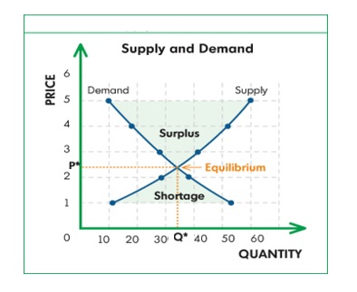
Supply and demand graphs is one of the most used tools in Economics. It depict the equilibrium between suppliers and consumers. The graph is an intersection of two curves mapped against quantity and price.
Demand curve has a negative slope as consumers are willing to pay a higher price for a low quantity of goods. As the price declines, the quantity demanded increases. Suppliers, on the other hand, are willing to supply a large quantity at a higher price and a low quantity at a lower price.